Your website is finally getting traffic, visitors are rolling in, and the pageviews are counting, great. Your marketing campaigns seem to work. However, if the conversion rate is not impressive and sales aren’t coming in, consider yourself in deep trouble.
Significantly low sales mean the visitors aren’t buying. It is of no use to have thousands of page-views every month with a poor conversion rate.
There could be several reasons why your website has poor conversion rate and why your visitors aren’t taking you seriously.
1. Autoplay videos
Imagine you have clicked on multiple links and there are more than 10 tabs in your browser. You start hearing a horrible ad. It is that autoplay video on one of those tabs you just opened. You click on every tab to get rid of the annoying video ad.
This happens to me several times every single day.
I am not alone, W3C says that autoplaying a video or an audio interrupt the user and is a hurdle in the navigation process.
Since autoplay videos are negatively associated with user experience and navigation process, therefore, visitors will eventually turn away.
Videos convert better than text, images, and other types of content. You cannot ignore videos especially if the conversion rate is dropping. You must use videos on product pages as it increases conversion rate by 9% and video views are positively associated with average order value. You just have to get rid of the autoplay.
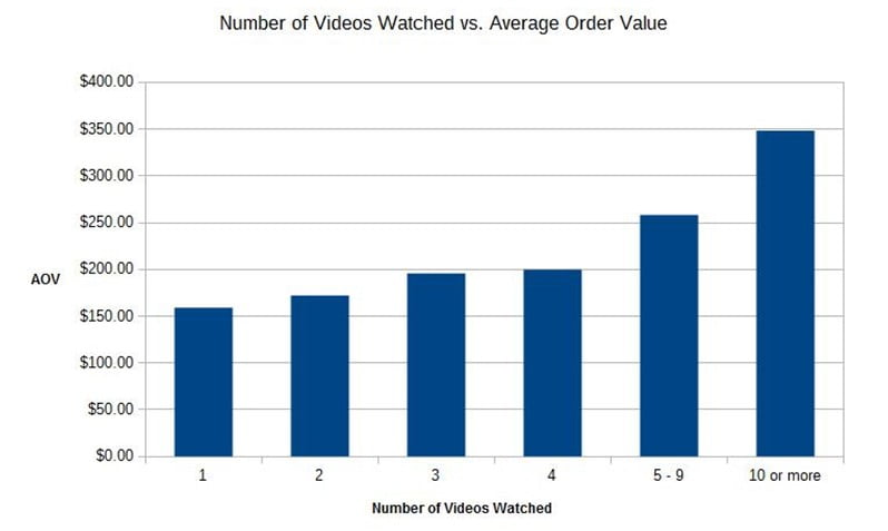
Use a powerful CTA to compel visitors to play the video.
Here is the hook. Use videos to increase conversions but don’t use autoplay.
2. Poor design
As high as 80% of people use smartphones to use the internet and to access their favorite websites, and the global number of mobile users has increased desktop users by a fairly massive margin. It is not just about the visitors but mobile compatibility is one of the most powerful ranking factors now.

Recently, Google has announced that it will take action against websites that use annoying popups on mobile devices that result in poor user experience.
So it is not just about your visitors if your website doesn’t do well on the mobile devices, it will lose its ranking.
There are, however, other design-related elements on your website that can help reduce conversion rate. These include:
- A poor website design with ads, sliders, rotators, bars, and annoying popups.
- Poor navigation that instead of helping confuse the visitors.
- Unformatted content without subheadings, bullets, and paragraphs.
- No CTA.
- Multiple CTAs.
With this in mind, visit your website critically and see how it looks. Is it easy to navigate? Can you find what you are actually looking for easily? Do popups and ads block the content?
Fix it once and for all.
3. Content mismatch
This happens to be the most common reason for low conversion rate.
Overly hyped ad copies, false claims, keyword stuffing in the titles and description, and driving traffic to your website for the sake of traffic will only add numbers on the analytics but nothing on the balance sheet.
The content on the landing page must align to what you have promised in the ad copy. If the blog title promises to share 75 tips to reduce bounce rate then make sure you share 75 tips in the article body because the visitors land on your website to read the 75 tips – nothing else.
Don’t promise something that you don’t have on the website.
The ad copy, titles, content, design, CTAs, product, lead magnet, and everything else must be properly aligned as this will lead to an increase in conversions.
When a visitor lands on your website, he does so to fulfill a need. Visitors look for a solution. Provide them with what they are looking for and they will become customers.
4. Poor call-to-action
The visitors don’t know, in most of the cases, what they are supposed to do once they are on your website. You have to tell then what ‘action’ they have to take.
Are they supposed to order a product, do they have to click on a button, do they have to sign up for the newsletter, or are they supposed to download a file?
Clearly tell them what they should do because if you don’t, they will leave without converting even if they loved your website.
A strong call-to-action must be used to boost conversions.
There should be at least one CTA above the fold on the landing page. Having multiple CTAs confuse the visitors. Make their life easy by adding a single but powerful CTA.
Here are a few quick tips to create a commanding CTA that delivers.
- Place your CTA above the fold.
- Keep it short, crispy, and simple.
- Clearly tell the visitors what they will get in return. Tell them why they should take the action.
- Use power words to make it actionable.
- Make sure that the CTA is relevant to the content, design, copy, and the offer.
- Create urgency.
The Netflix’s CTA is a perfect example. It is short, above the fold, it clearly communicates the benefit, you know what you are supposed to do once you are on their website, and it kills the fear with bold statement ‘Cancel anytime’.

It is, however, not a quick fix. You must test multiple CTAs to see what works for your audience.
5. Dreadful site load time
Your site’s load time is a critical Google ranking factor which means you lose ranking, visitors, and conversions if your site loads poorly.
Just think for a moment, why a potential visitor should wait for your website to load when he has thousands of other websites to choose from? Why should he waste time with a website that doesn’t load on time?
Not just that you lose visitors, it negatively impacts the conversion rate. A mere delay of a single second is supposed to hit your conversion rate.
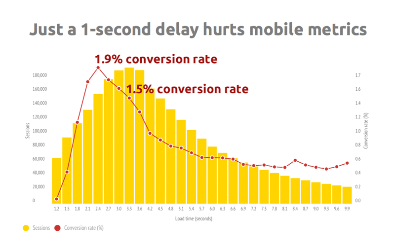
If the video on the landing page doesn’t load or the CTA button doesn’t show up instantly, what your visitors are supposed to do?
Besides, it sends a really non-professional, or I must say, a bad signal to your target audience.
Fortunately, reducing page and website load time is pretty much in your hands.
- Browser caching is the first thing that should be enabled.
- Use an online compression tool such as Tinypng to compress images before uploading them to your website. Compressed images load faster.
- Uninstall unnecessary plugins. In fact, there isn’t much need of using a lot of plugins. Just stick to the basic ones.
- Combine external sheets.
- Load the scripts from the footer.
Conclusion
Improving or increasing conversion rate isn’t simple because you don’t have any idea what steps or actions will do the trick. It is all about testing and tweaking. At times, it is just about adding or removing a single word from the CTA.
Let’s start it from the elements that can be altered easily. Change one item at a time to see its impact. Eventually, you will find the winning combination.

