Developing an awesome software for your SaaS business is the beginning. The real challenge begins when you realize that nobody is interested in your ‘product’. Converting visitors into customers is challenging for any SaaS business.
Research shows that the average conversion rate for SaaS industry sits around 7%. If your website converts at 7% or higher, you’re doing great.
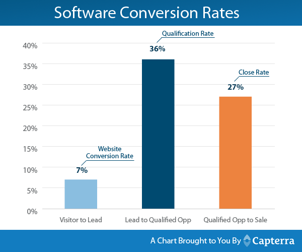
However, if your SaaS website is converting at a rate less than 7%, you need to improve it. Following 7 tips to increase SaaS conversion rate will help you achieve results you expect.
1. Make sign up process simple
Make sign up form short and sweet so potential buyers can try your product instantly. A clean and simple sign up process is the first thing that needs your attention.
A sign up process has two distinct parts:
- The steps that a user has to take to get access to your software for the first time.
- The sign up form.
Sign up process steps
Let’s begin by reducing the sign up process steps.
Imagine, users need to create an account, verify email address, download your software, install it, and then explore it. What do you think, will they take the pain?
Here is how sign up process works at MailChimp.
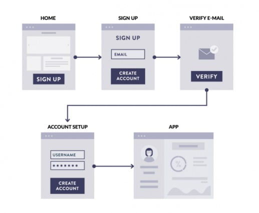
Visitors have to provide all their information upfront before getting access to the email software. This happens to be the most common sign up process used today, but it isn’t good at increasing conversion rate.
Why?
Users don’t know what they will receive.
On the other hand, here is a sign up process that gives full (or limited) access to the software before sign up.
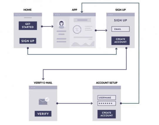
Impress your clients with your awesome product, and then ask them to sign up.
This is the sign up process that is not very common but it boosts conversion rate and reduces churn rate.
Because visitors can get access to the software immediately and if they like it, they will sign up without hesitation and will be more likely to stay with you.
Free Logo Design lets you create a logo without any sign up.
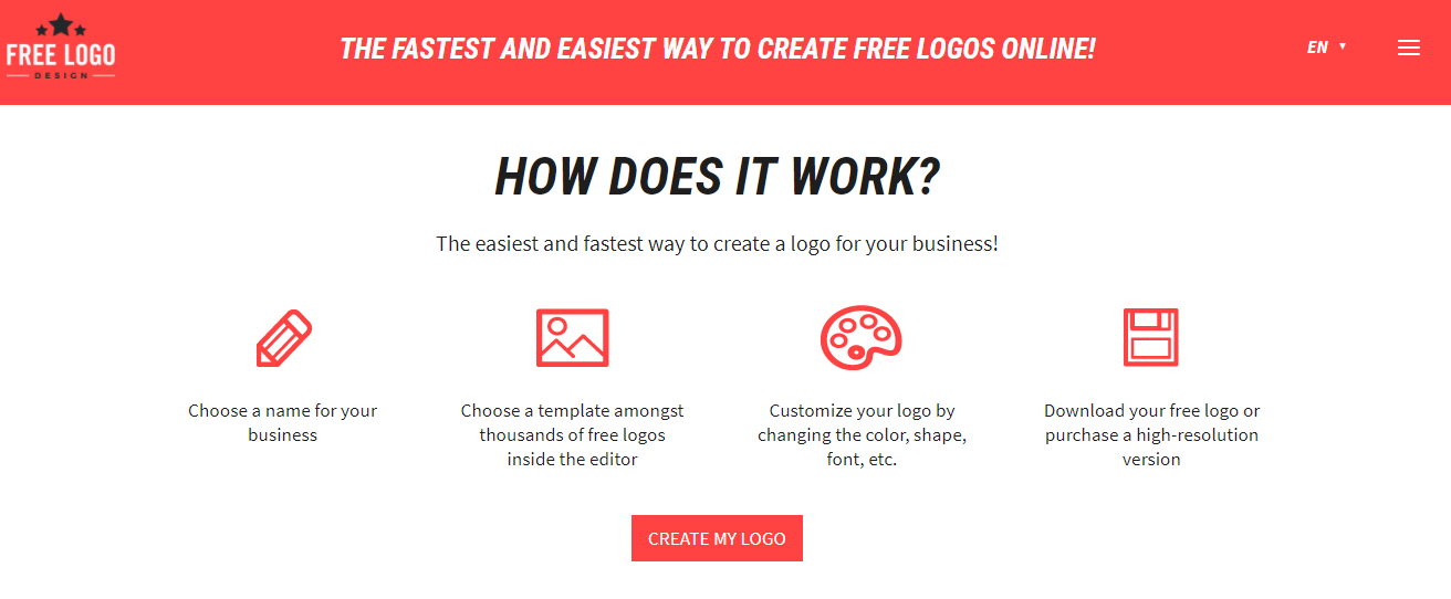
As soon as you click Create My Logo, you get access to the tool. You can create your first logo right away.
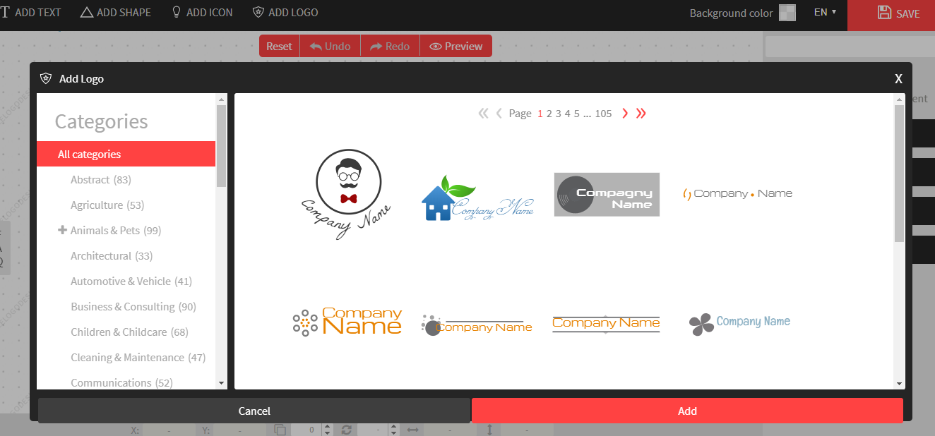
After logo has been created, you’re then asked to sign up to save/download it.
Here is the deal – give full access to your software upfront. Show your customers what you have got and then ask for sign up.
This process is sure to increase conversions.
Sign up form
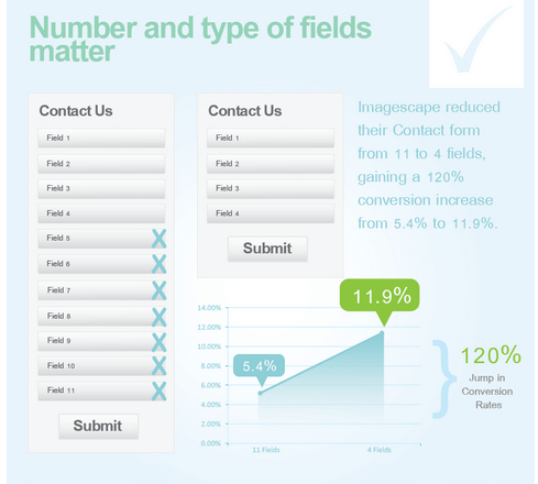
A long sign up form will turn visitors away. Even if access to the app was given upfront, you still need to reduce form fields to a minimum. ImageScape increased its conversion rate by 120% by reducing fields in the contact form from 11 to 4.
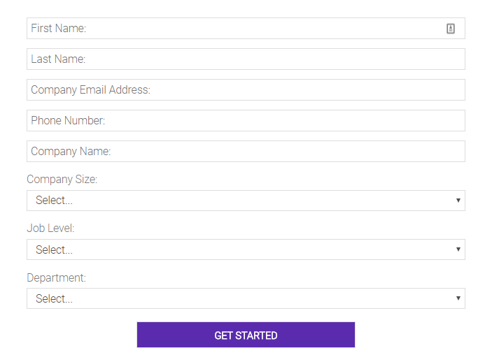
This is the form you have to fill to get access to Jive’s free trial.
And this is what Asana asks to get started.
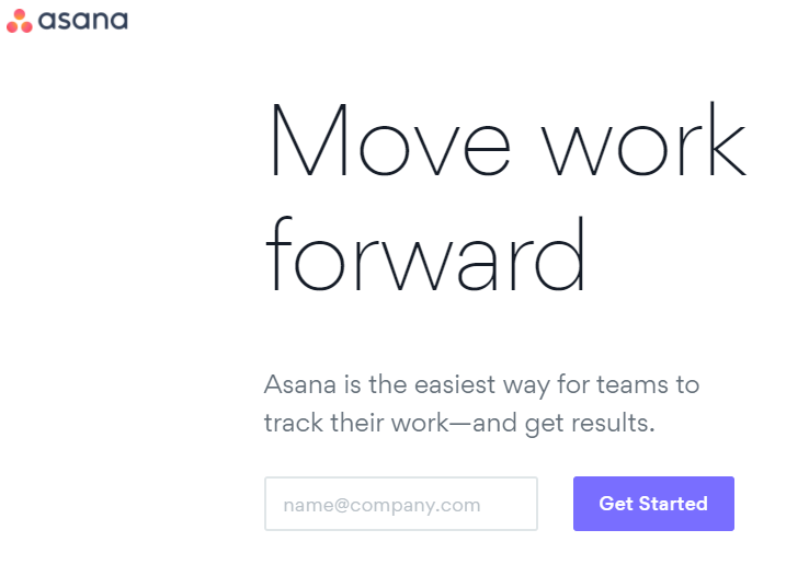
The rule is simple – don’t ask if you don’t need it.
2. Improve customer onboarding process
What happens when you register for free with Asana, you have converted.
Great.
But you aren’t a paid customer. And you’re using the app.
That’s where customer onboarding plays a significant role in conversion rate (and SaaS churn).
If customers don’t see how your app can benefit them or how to use it, they will quit almost immediately. This is what hurts conversions.
A free trial is a fairly famous SaaS conversion optimization technique where the intention is to convert free users into paid customers. But research shows that only 25% of free trial signups are converted to paid customers.
A poor customer onboarding process is a major factor. It makes or breaks the deal. It helps users decide whether to stay or leave.
The first week is critical here.
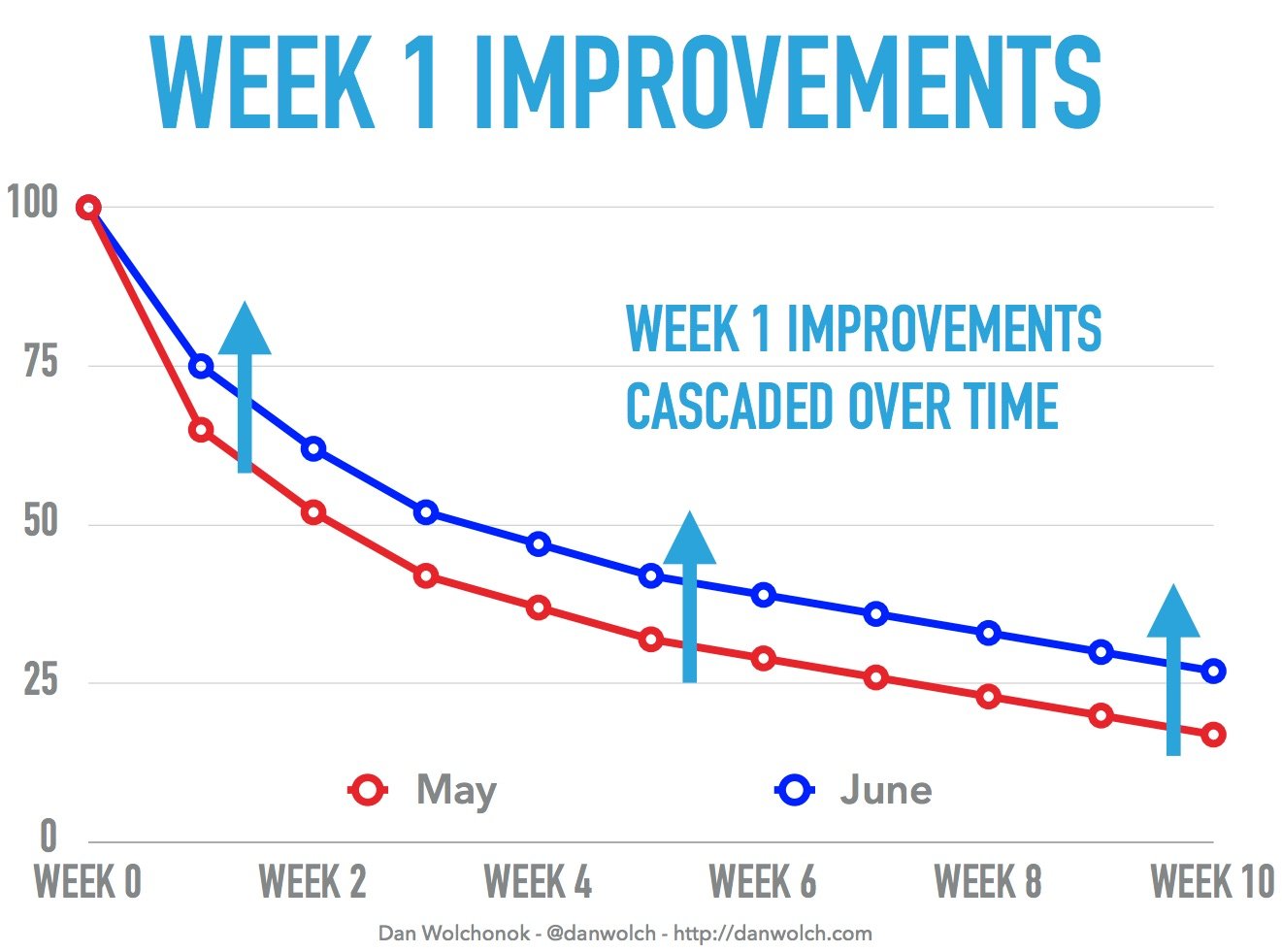
Here is what you’re supposed to do to make users stick and to convert them into paying customers:
- Make your app easy as hell for them
- Help them solve their problem (that persuaded them to use your software)
- Train them to use your product
- Follow up via email so as to help them get started
Clash Royale has a perfect onboarding process that gets you started in under 5-minutes. New users are trained via a mock battle and things keep moving.

3. Show how your software will help them
Sure, a great onboarding process helps boost conversion rate but that’s not all.
Evernote, for instance, allows its users to take a quick tour of their app.
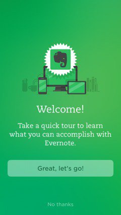
In five simple steps, it shows you how Evernote can help you.
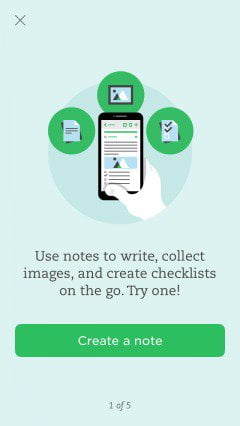
In reality, users need to see and experience to learn and figure out how your software will help them solve their problem.
When you’re training, guiding, and helping first-time users understand the benefits of your app, you’re involved in helping users achieve their first success with your product.
First-time users need to know three things to continue their trial and convert into a paying customer:
- How to use your app
- Why they should use it
- How to do what they want to do
Your job is to make sure every user gets to know your app. The earlier you do it, the better.
4. Make checkout easy
So you have pushed a fairly decent number of free app users to your checkout process by showing them how awesome your software is – great.
Your checkout process might be a hurdle that’s stopping users to buy.
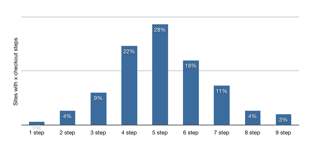
Statistics show that majority of the online stores, including SaaS, use 5-step checkout process. And this is one reason why a poor conversion rate is your software’s fate.
Avangate increased its checkout page conversion rate by 12%. They removed a few fields from the billing form.
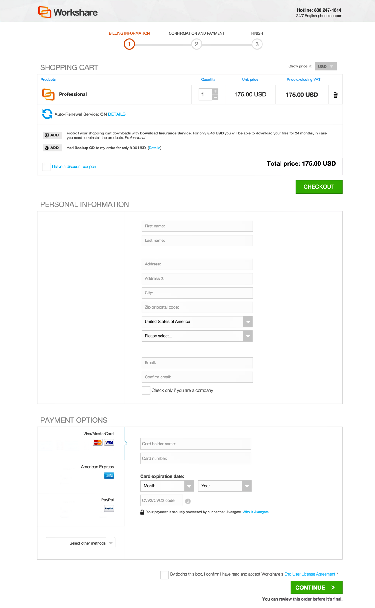
When dealing with checkout, remember one golden rule: Less is more.
Here are a few techniques to make your checkout process smooth and simple:
- Reduce checkout process steps. Make checkout a single screen process.
- Offer multiple payment solutions. No, PayPal isn’t just enough as it is not available in several countries and you never know, you might lose a good chunk of customers from a specific location. Don’t take chances.
- Refrain from redirecting users to payment gateway page. It’s best if you can keep users on-site.
- Remove all unnecessary fields. You already have half of their information so your best bet is to ask for a billing address and payment details, that’s all what you need. If you need more information, conduct a survey. Don’t use checkout page as a data collection tool.
- Monitor cart abandonment. Follow up with the users who didn’t complete their payment. Ask and fix what’s bothering them.
- Use guest checkout if you take payments upfront. Don’t force visitors to register or create an account first. It reduces conversion rate by 25.6%. Let them buy first, and then ask for registration.
Here is a short and sweet checkout page by DistroKid. It asks for credit card details and that’s it.
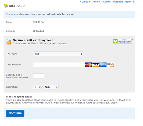
Use something similar for your business.
5. Use multiple personalized landing pages
What happens when a visitor lands on your landing page? Do you have a single landing page that every visitor gets to see?
Sounds too boring.
And a reason why visitors don’t convert.
According to HubSpot, as you increase number of landing pages, conversion rate increases. In fact, when the total number of landing pages is changed from 1-5 to 6-10, increase in leads jumps by a whopping 55%.
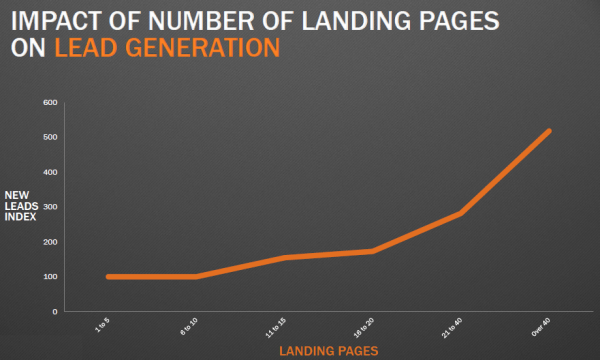
So the first rule is to use multiple landing pages. The more you have, the better.
The second rule – use personalized landing pages that communicate with the visitors. Here is an example of how FreshBooks takes personalization to a whole new level with its personalized referral landing page.
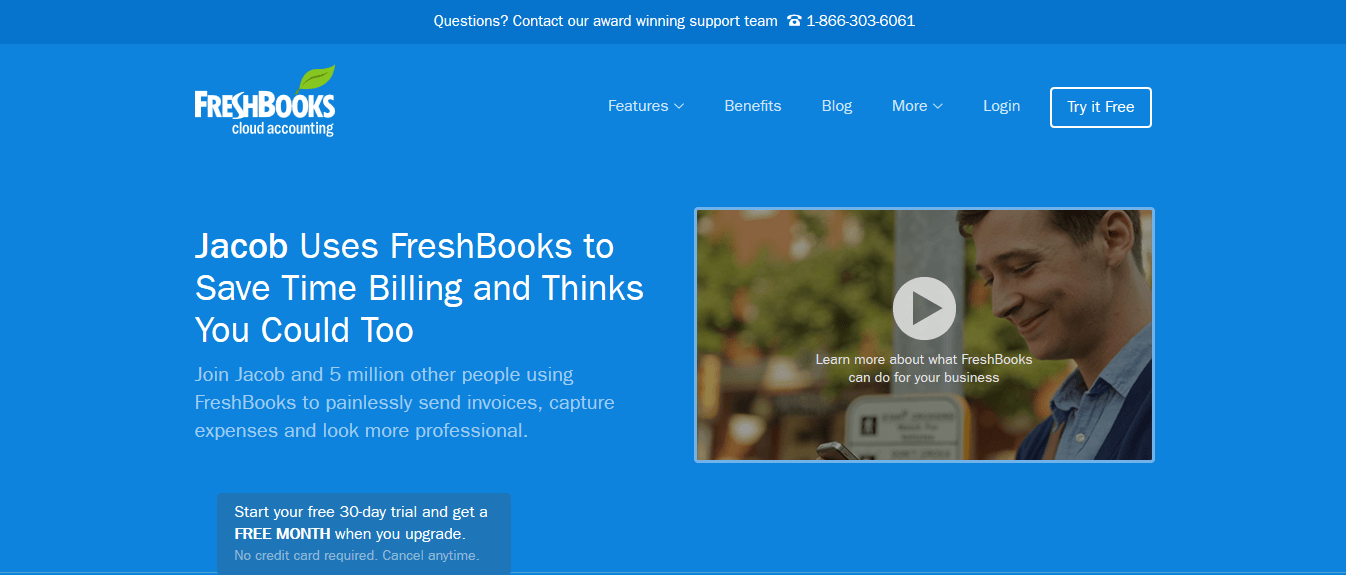
There are two major benefits of using a personalized landing page like this:
- It talks with the visitor.
- It boosts conversion rate as recommendation from a friend is as much as 50x more likely to result in a conversion.
If you’re using referral marketing, you’d know how to do it with your tool.
Nevertheless, you can customize landing pages based on several variables like demographics, location, IP address, device, and so on.
For instance, here is the landing page that Obama used for traffic from Reddit.
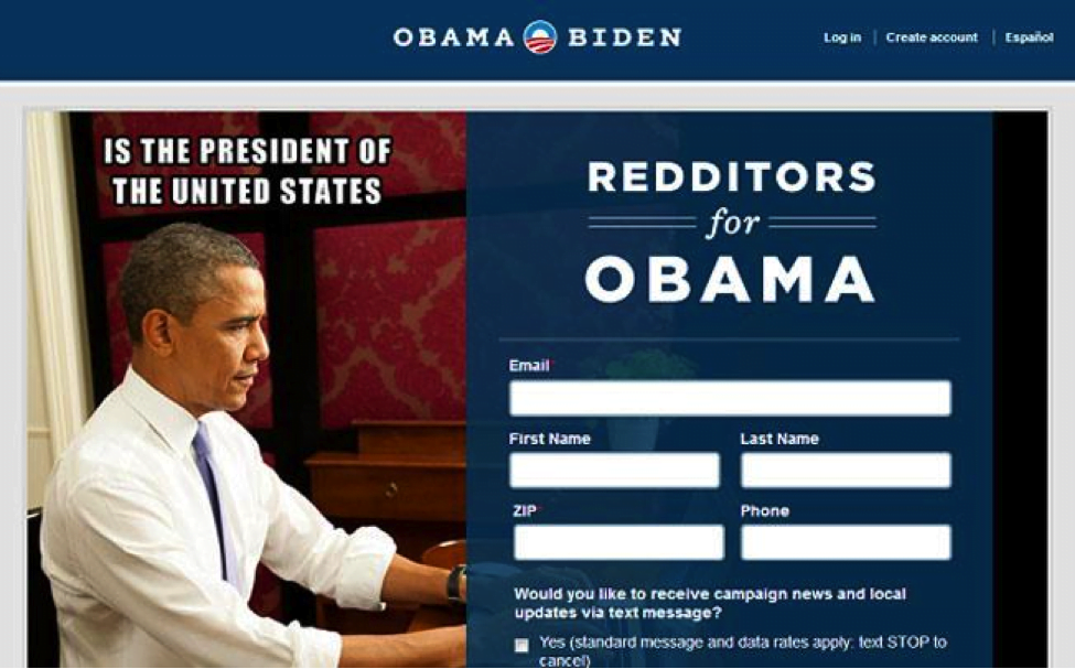
Looks impressive, right?
Start using them to boost conversions.
6. Work on CTA
A major part of your landing page that drives conversions is a Call-to-Action (CTA). A CTA makes visitors click. It persuades them to take action. It tells them what they’re supposed to do (next).
Make CTA prominent so visitors can easily find it and take action. Make it clutter-free.
Here is an example on how making CTA button prominent increased conversion rate by 357%.
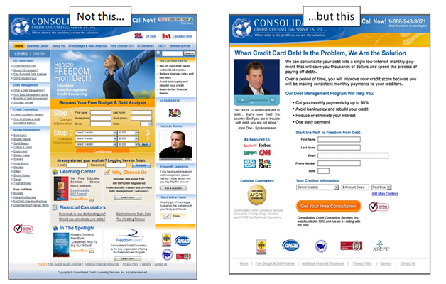
Here are few CTA best practices that will help you improve conversion rate:
- Move it above-the-fold. It can increase conversion rate by 20%.
- Make sure your landing page has one CTA. Don’t confuse visitors with multiple CTAs.
- Make it benefit-driven.
- Keep it short and clean.
7. Follow up religiously
Even if you have followed all the 6 tips discussed above, you’ll still have several free users who didn’t convert.
Statistics show that the average SaaS conversion rate (from visitor to a retained customer) is no more than 1.2%.
While sending an awesome email at the end of the trial like this has fair chances of converting at an exceptional rate, but this isn’t normally a much-appreciated approach.
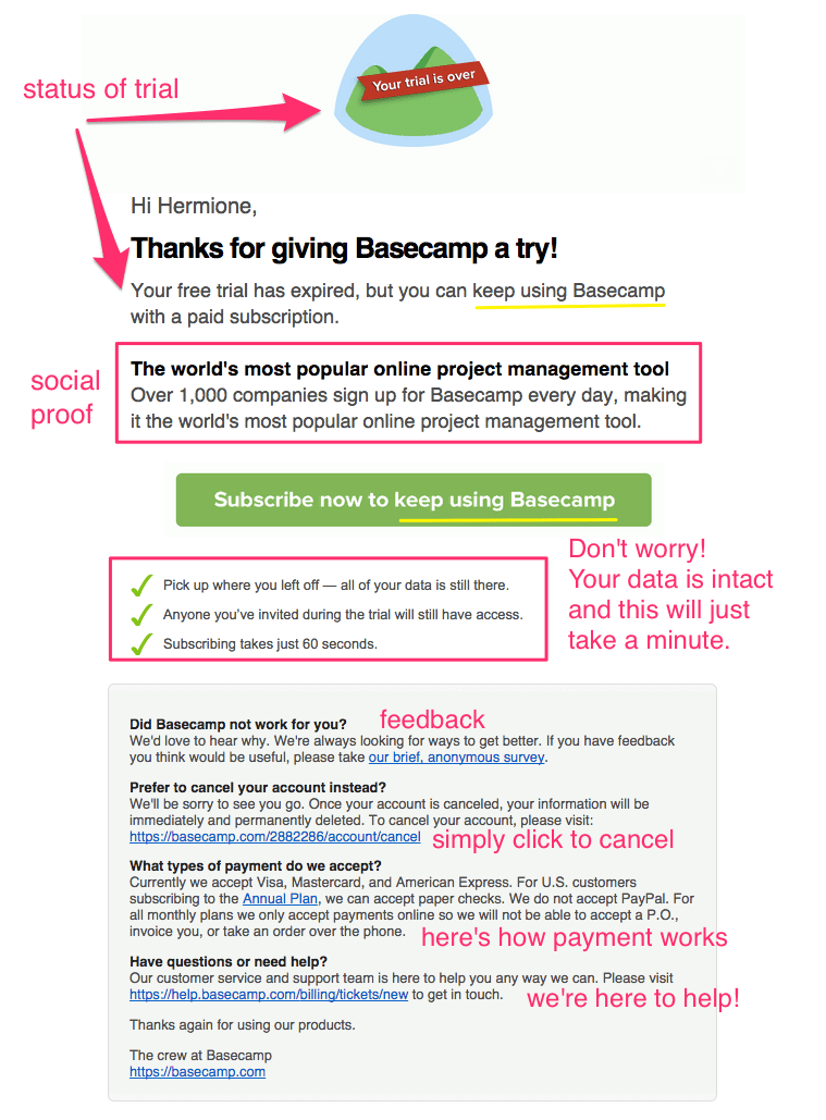
A powerful follow up sequence wins the day. Groove sends several emails to its active as well as inactive users throughout the trial period.
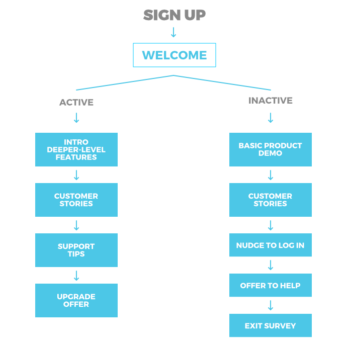
This technique works. Research shows that the first 10 days are most crucial and sending personalized emails in the first 10 days results in one conversion per 6 users.
Let’s prepare a personalized email sequence based on users’ behavior, demographics, usage, and other variables to boost conversion rate.
Conclusion
I hope these 7 tips will help you increase SaaS conversion rate. While implementing these tactics will help, you’ll have to test and tweak to get better. There is no end to improvement.
There is always room to get better. Let’s grow your SaaS company.

